
Neon Sign Color Psychology: How to Choose the Right Color
01 MayWalk past any busy street after sunset, and you’ll notice it, the quiet pull of glowing signs. Some feel excited. Others feel calm and reassuring. It’s not random. Color plays a bigger role than most people expect when it comes to neon.
Choosing the right neon sign colors isn’t only about what looks good. It’s about what feels right. And that feeling can influence how people react to a space, a brand, or even a single message.
This article explains how color works in neon lighting, what different colors communicate, and how to choose a combination that fits your purpose, not only aesthetically but also psychologically.
How Neon Lighting Shapes What We See
Neon lighting does something interesting. It doesn’t display color; it amplifies it. The glow softens edges and spreads light in a way that makes colors feel more alive, sometimes even exaggerated.
A simple blue in regular lighting can feel flat. But in neon, it becomes deeper and more immersive. That’s part of the appeal of neon signage: it turns ordinary colors into experiences.
This is also why selecting from a neon light color palette requires a bit more thought. Colors behave differently when they glow. What seems subtle in daylight might become overwhelming at night.
Understanding the Emotional Side of Neon Colors
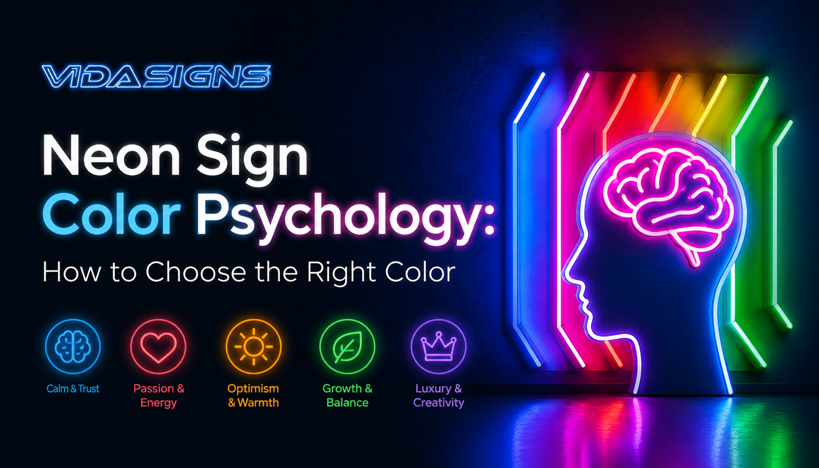
When people talk about neon sign color psychology, they’re really talking about how colors trigger emotions. It’s not always logical. Sometimes it’s instinctive.
A red sign can feel urgent even if the message isn’t. A soft pink can make a space feel welcoming, even if it’s only a wall.
The point is color isn’t decoration. It’s communication.
Red Neon – Energy, Passion, and a Sense of Urgency
Red is hard to ignore. In neon form, it becomes even more intense. It’s used where attention matters in restaurants, bars, and late-night shops.
There’s something about red that feels immediate. It pushes you to act, even if you don’t fully realise it. That’s why many businesses lean toward red when selecting neon sign colors for high-impact messaging.
But it can be a bit overwhelming if overused. A small red sign works. An entire red-lit space? That can feel a bit too much.
Blue Neon – Calm, Trust, and Professional Tone
Blue is almost the opposite of red. It slows things down. It feels stable, reliable.
You’ll see blue in offices, tech environments, or places that want to feel trustworthy. A neon signage light in blue can soften a space without making it feel dull.
It’s also the safer choice if you’re unsure. Though sometimes safe can mean forgettable, so it depends on what you’re aiming for.
Pink Neon – Playful, Romantic, and Creative
Pink has a personality. It’s fun, expressive, and slightly unconventional.
In neon, it becomes even more vibrant. Think of boutique stores, cafés, or creative studios. Pink doesn’t only decorate, it sets a mood.
It’s included in a neon light color palette when the goal is to feel approachable and a little different.
Yellow Neon – Bright, Cheerful, and Attention-Grabbing
Yellow is tricky. It’s bright, optimistic, and energetic. But it can also be overpowering if not used carefully.
A small yellow neon sign can feel warm and inviting. Too much yellow can strain the eyes.
Still, it’s one of those neon sign colors that instantly draws attention. That’s why it’s used for highlights rather than full designs.
Green Neon – Fresh, Natural, and Balanced
Green tends to feel calming, but in a different way than blue. It feels organic.
It works well for brands connected to health, sustainability, or nature. A green neon signage light can make a space feel relaxed without losing visual interest.
It’s also surprisingly versatile. Dark green feels sophisticated, while lighter shades feel more playful.
Purple Neon – Creative, Luxurious, Slightly Mysterious
Purple sits somewhere between calm and bold. It carries a sense of creativity, sometimes even a hint of luxury.
In neon, it can feel almost surreal. Not something you see every day, which is why it stands out.
If you’re building a neon light color palette that needs personality, purple is a good choice.
White Neon – Clean, Minimal, and Timeless
White neon is understated. It doesn’t shout. It doesn’t compete.
It’s used where clarity matters for logos, simple messages, or modern interiors.
Among all neon sign colors, white feels the most neutral, but not in a boring way.
Orange Neon – Warm, Friendly, and Energetic
Orange sits between red and yellow, and you can feel both influences. It’s energetic, but not aggressive. Warm, but not overwhelming.
It’s a good choice when you want something lively but approachable.
Choosing the Right Color for Your Neon Setup
Picking colors isn’t only about preference. There are practical factors too, some obvious, some easy to overlook.
Sign Size Matters More Than You Think
Large signs amplify color intensity. A bold color on a small sign can feel balanced. The same color on a large surface might feel excessive.
Where It Will Be Installed
Indoor lighting, outdoor exposure, and surrounding colors all of these affect how neon appears. A color that works beautifully indoors might look washed out outside.
Height and Viewing Angle
If your sign is placed high up, brighter or more contrasting neon sign colors work better. Subtle tones can get lost.
Aligning With Brand Identity
This one sounds obvious, but it’s rushed. Colors should match your brand, not only visually, but emotionally.
If your brand is calm and minimal, a loud red sign might send mixed signals.
Readability and Visibility
This is where many designs fall short. Style matters, but if people can’t read the sign easily, it loses its purpose.
Contrast is key here.
Who You’re Trying to Reach
Different age groups and audiences respond to colors differently. Younger audiences might respond well to bold, playful palettes. More professional audiences might prefer subdued tones.
Adding a Personal Touch
Sometimes, the best choice isn’t the most logical one. It’s the one that feels right for your space.
That’s where personalisation comes in for projects like custom neon signs NYC, where individuality matters as much as branding.
How Neon Materials Influence Color
The colors you see in neon signs aren’t only about the outer coating. They come from gases, coatings, and tube materials.
Different gases produce different hues, and coatings can modify or soften those tones. This is why the same color can look slightly different depending on how it’s made. It’s a subtle detail, but it matters when building a cohesive neon light color palette.
Building a Neon Color Palette for Your Design
So, what exactly is a neon light color palette?
It’s a group of colors chosen to work together in a neon design. But in practice, it’s more than that.
Ways to Combine Colors Effectively
Complementary Pairing
This uses colors on opposite sides of the color wheel, like blue and orange. It creates a strong contrast and high visibility.
Analogous Blends
These are colors next to each other, like blue, teal, and green. They create a smoother, more cohesive look.
Triadic Combinations
This approach uses three evenly spaced colors. It’s vibrant but balanced if done right.
Split-Complementary Approach
A slightly softer version of complementary schemes. It gives contrast without being too harsh.
Choosing the right combination of neon sign colors within these schemes can completely change how your sign feels.
Conclusion
At first glance, choosing neon sign colors might seem like a simple design decision. But it’s not only about aesthetics, but it’s also about perception, emotion, and clarity.
A well-chosen neon light color palette can make a space feel inviting, exciting, or even calming. The wrong choice can have the opposite effect.
Whether you’re exploring neon signs for sale or designing something from scratch, it helps to pause and think about what each color is saying.
Even in a place like neon-light NYC, where bold visuals are everywhere, the signs that stand out aren’t always the brightest. They’re the ones that feel right.
Looking to create something that truly stands out? VIDA Signs specialises in designing custom neon pieces that reflect your brand and personality. From concept to installation, they guide every step with care and precision. Whether for business or personal use, our team ensures quality and impact.
Call (212) 388 -9388 to bring your vision to life with professionally crafted neon signage that captures attention and leaves a lasting impression.
FAQs
What determines the color of a neon sign’s light?
The color comes from the gas inside the tube and any coatings applied to the glass. Different gases emit different hues, while coatings adjust brightness, tone, and overall visual effect of the light.
What color neon signs should you choose?
Choose based on purpose, brand identity, and environment. Bright colors attract attention, while softer tones create a mood. It’s a balance between visibility, emotion, and how the color fits your overall design.
What three highly contrasting colors can I choose for my neon sign?
A common high-contrast combination includes blue, orange, and white. These colors stand out visually and remain readable, making them effective for bold signage that needs to catch attention quickly.
How can I choose the best custom colors for my neon signage?
Start with your brand colors, then test how they look in neon lighting. Consider contrast, placement, and audience response. Sometimes, slight adjustments are needed to achieve the right balance and visibility.
Are LED neon colors different from traditional neon?
Yes, LED neon offers a wider range of consistent colors, while traditional neon has a more organic glow. Both have unique visual qualities, and the choice depends on the style and effect you prefer.
How do I match neon colors with my brand?
Focus on your brand’s core tone, whether it’s bold, calm, or creative. Then choose neon colors that reflect that feeling. Consistency matters more than exact matches when translating colors into glowing formats.