
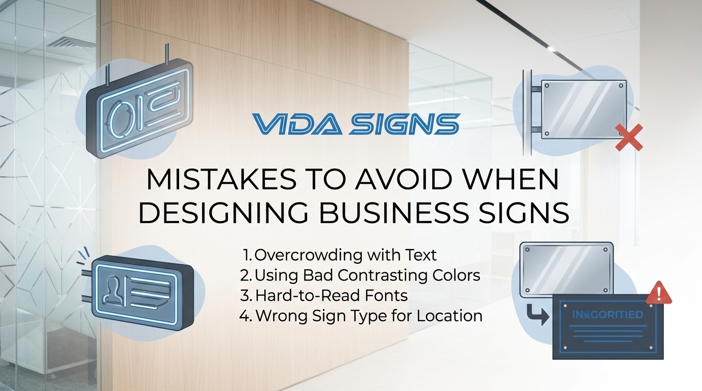
Mistakes to Avoid When Designing Business Signs
06 MarBusiness signs are one of the most important marketing tools for any physical location. Before customers walk into a store, restaurant, or office, the sign outside often creates their first impression. A well designed sign can capture attention, communicate brand identity, and guide customers toward your business.
However, many businesses make common design mistakes that reduce the effectiveness of their signage. A poorly designed sign can be difficult to read, easy to overlook, or even create a negative impression of the brand. When this happens, potential customers may pass by without even realizing what the business offers.
Designing an effective sign requires careful attention to details such as colors, fonts, size, materials, and placement. Avoiding common mistakes can significantly improve visibility and attract more customers. Understanding these issues can help businesses create signage that truly stands out.
Why Good Sign Design Matters for Businesses
Good signage plays a crucial role in how customers perceive and locate a business. In busy streets or commercial areas, people are surrounded by multiple stores competing for attention. A clear and attractive sign helps your business stand out in this environment.
Sign design also influences brand recognition. When customers repeatedly see a well designed sign with consistent colors and branding, the business becomes familiar to them. Over time, this familiarity increases trust and encourages people to visit the store.
Effective signage also improves navigation. Customers often rely on signs to identify locations quickly while walking or driving. If the sign is clear and visible, they can easily find the business without confusion.
Common Mistakes to Avoid When Designing Business Signs
Many businesses unintentionally create signs that do not perform well. Avoiding these common mistakes can make a significant difference in how visible and effective your signage becomes.
1. Using Fonts That Are Hard to Read
One of the most common mistakes in sign design is choosing fonts that are difficult to read. Highly decorative or overly complex fonts may look interesting in design previews, but they can become hard to understand from a distance.
Business signs should prioritize readability above everything else. Simple and clear fonts allow people to quickly recognize the business name even while walking or driving by.
When selecting a font, it is important to consider viewing distance and lighting conditions. A font that appears clear on a computer screen may not be readable when placed on a building.
2. Choosing Poor Color Combinations
Color plays a major role in sign visibility. If the text color blends into the background, the message becomes difficult to read. Low contrast combinations such as light gray text on a white background can make the sign nearly invisible.
Effective signage uses strong contrast between text and background colors. This helps the message stand out clearly and ensures that customers can read it from a distance.
Bright and bold colors can also attract attention, especially in crowded commercial environments.
3. Adding Too Much Information
Many businesses try to include too much information on their signs. This often results in cluttered designs that are difficult to read quickly.
A sign should communicate its message within a few seconds. If customers need to stop and study the sign to understand it, the design may not be effective.
Keeping the message simple ensures that viewers can quickly recognize the business name and its main purpose.
4. Ignoring Proper Sign Size
Another common mistake is choosing a sign that is too small. If the sign cannot be seen or read from the street, it will not attract attention.
The size of a sign should match the viewing distance. Businesses located on busy roads often require larger signage so drivers can read the message quickly.
Proper sizing ensures the sign remains visible and effective in its surroundings.
5. Poor Sign Placement
Even a well designed sign will not perform well if it is placed incorrectly. Signs that are hidden behind trees, poles, or architectural elements may go unnoticed.
Placement should always consider the natural line of sight for pedestrians and drivers. Positioning the sign where people naturally look improves visibility and effectiveness.
Lighting conditions should also be considered when deciding where to place signage.
6. Not Considering Lighting
Lighting is often overlooked during the design process. Signs that are not properly illuminated may become difficult to see at night or during cloudy weather.
Businesses that operate in the evening should consider illuminated signage or external lighting solutions. Proper lighting ensures the sign remains visible throughout the day and night.
Well lit signage also enhances the professional appearance of a storefront.
7. Using Low Quality Materials
Cheap materials may reduce initial costs, but they often lead to long term problems. Signs made from low quality materials may fade, crack, or become damaged due to weather conditions.
Durable materials such as metal, acrylic, or high quality plastics ensure the sign maintains its appearance over time. This helps preserve the professional image of the business.
Investing in quality materials also reduces maintenance and replacement costs.
8. Ignoring Brand Consistency
Your signage should reflect the overall brand identity of the business. When colors, fonts, and design styles do not match the brand image, customers may find the business less memorable.
Consistent branding across signage, marketing materials, and digital platforms strengthens brand recognition. This consistency helps customers easily identify the business.
A cohesive visual identity makes the business appear more professional and organized.
9. Not Following Local Sign Regulations
Different cities and municipalities often have rules regarding sign size, lighting, and placement. Businesses that ignore these regulations may face fines or be required to remove their signage.
Understanding local guidelines before designing a sign can prevent unnecessary complications. Working with experienced professionals can help ensure compliance with these regulations.
Local expertise is especially helpful in large metropolitan areas where signage rules may be more complex.
10. Trying to Design Signs Without Professional Help
Designing effective signage involves more than creativity. It requires knowledge of visibility, materials, lighting, and installation techniques.
Many businesses benefit from working with an experienced Sign Company NYC that understands how to create signage that is both visually appealing and highly effective.
Professional designers consider factors such as viewing distance, environmental conditions, and local regulations to produce signage that performs well.
Businesses also explore different options such as neon signs for sale when looking for vibrant and attention grabbing signage that enhances storefront visibility.
Modern manufacturing methods such as laser cut signs also allow businesses to create highly precise and visually impressive signage designs.
Tips for Designing Effective Business Signs
Creating an effective sign starts with a clear understanding of your brand and audience. The design should communicate the business identity in a way that is easy to understand and visually appealing.
Choosing readable fonts and high contrast colors ensures the message remains clear from a distance. Simplicity is often the most effective approach when designing signage.
Durability should also be a priority. Outdoor signs must withstand weather conditions while maintaining their appearance. Investing in high quality materials ensures long lasting results.
Proper placement and lighting complete the design. A well positioned and well lit sign increases visibility and attracts more potential customers.
Conclusion
Business signs play a vital role in attracting customers and building brand recognition. When designed correctly, signage can become one of the most effective marketing tools for a physical location.
However, common design mistakes such as poor color choices, unreadable fonts, and improper placement can reduce the effectiveness of a sign. By avoiding these issues, businesses can create signage that stands out and communicates clearly.
Investing in thoughtful design, durable materials, and professional expertise ensures that your business sign continues to attract attention and support your brand for years to come.
FAQs
Why is sign design important for businesses?
Sign design is important because it influences how customers perceive and locate a business. A clear and attractive sign helps people quickly identify the store and understand what it offers.
Well designed signage also strengthens brand recognition and creates a professional first impression that encourages customers to visit.
What fonts are best for business signage?
Simple and clear fonts are usually the best choice for business signage. Fonts that are easy to read from a distance help customers quickly recognize the message.
Sans serif fonts and bold lettering often work well because they maintain readability even in bright sunlight or low lighting conditions.
How do colors affect sign visibility?
Colors play a major role in how easily a sign can be seen. High contrast color combinations make text stand out from the background.
For example, dark text on a light background or bright text on a dark surface improves readability and helps the sign attract attention.
Why should signs avoid too much information?
Signs should communicate their message quickly because people often see them while walking or driving past. Too much information can make the sign look cluttered.
A simple and focused message allows customers to understand the business name and purpose within seconds.
What materials are best for outdoor business signs?
Outdoor signs should be made from durable materials that can withstand weather conditions. Aluminum, acrylic, and treated wood are commonly used because they are strong and long lasting.
High quality materials help the sign maintain its appearance and prevent fading or damage over time.
How does lighting improve sign effectiveness?
Lighting makes signs visible during nighttime and poor weather conditions. Illuminated signs ensure the business remains noticeable even after sunset.
Good lighting also enhances the design of the sign and gives the storefront a more professional appearance.
Why is sign placement important?
Sign placement determines whether customers can easily see and read the message. Signs that are hidden or placed too high may be overlooked.
Positioning the sign at eye level or along natural viewing paths improves visibility and increases the chances of attracting attention.
Should businesses follow local sign regulations?
Yes, businesses must follow local regulations related to sign size, lighting, and placement. These rules are designed to maintain safety and visual order in commercial areas.
Working with signage professionals can help ensure that the design meets all local guidelines.
How long do business signs typically last?
The lifespan of a business sign depends on the materials used and environmental conditions. High quality signs made from durable materials can last many years.
Regular maintenance and proper installation also help extend the life of the signage.
Why should businesses hire professional sign designers?
Professional sign designers understand how to create signage that balances aesthetics and functionality. They consider factors such as visibility, materials, and placement.
Their expertise helps businesses avoid common mistakes and ensures the final sign effectively attracts customers.