

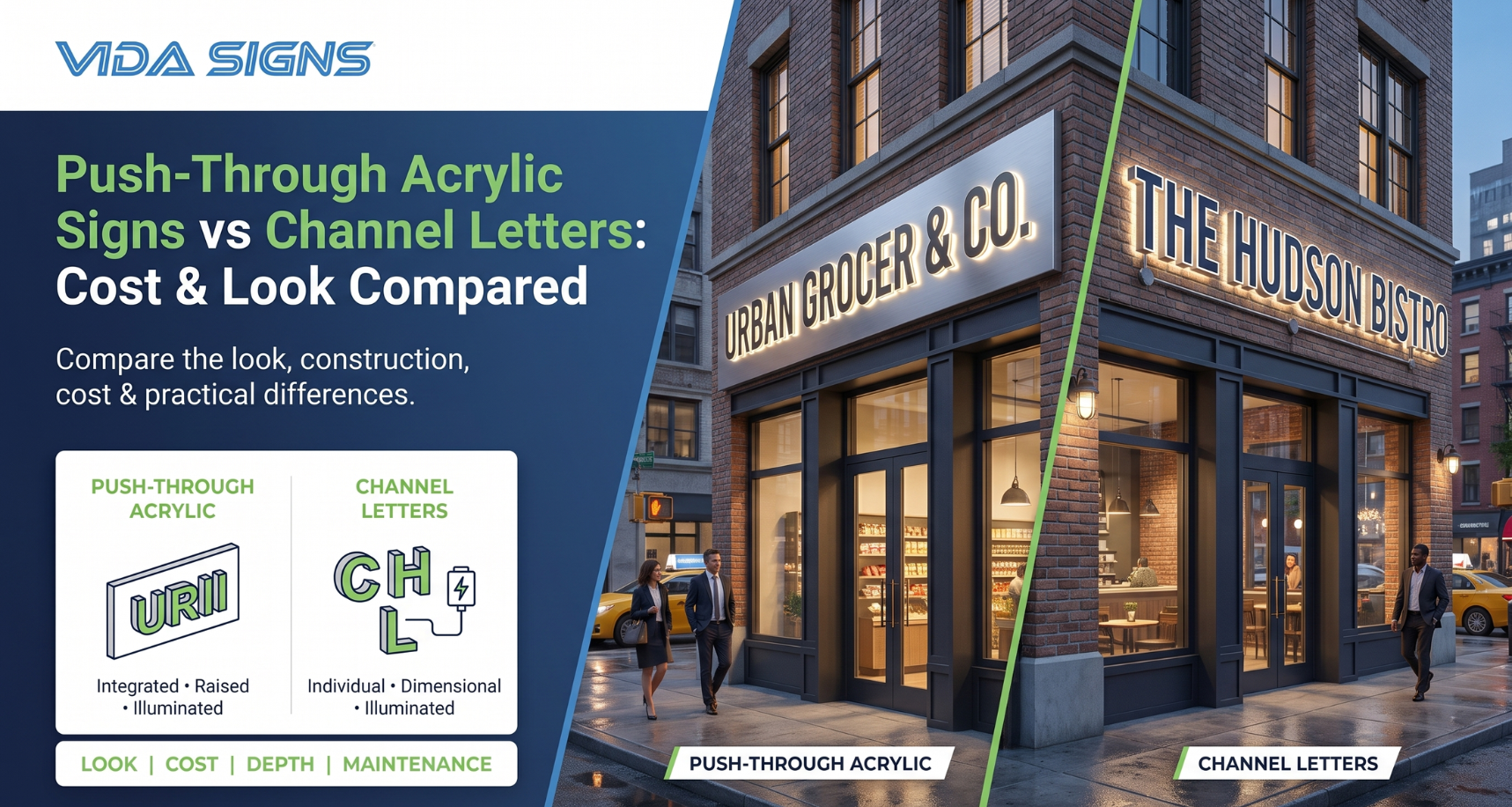
Push-Through Acrylic Signs vs Channel Letters: Cost & Look Compared
04 SepPicking a storefront sign might seem easy at first, but it gets more complicated once you look at materials, lighting, depth, installation, and maintenance. Two common choices are push-through acrylic signs and channel letters. Both can give your storefront a polished, illuminated look, but they create different visual effects.
The better choice often comes down to the personality of the business, the building itself, and how much visual impact you want from the street.
This guide compares the look, cost, construction, durability, and practical considerations of both sign styles so you can decide which works best for your storefront.
What Are Push-Through Acrylic Signs?
Push-through acrylic signs are three-dimensional signs made by fitting acrylic letters or graphics into a solid sign face, usually with LED lights behind the acrylic. The acrylic parts stick out from the surface, creating raised letters.
They are particularly useful when a business wants a clean, contemporary sign without having every individual letter housed in a separate enclosure.
How They’re Made
The process usually begins with a rigid sign face, often made from aluminum or another suitable material. Lettering and graphics are cut into the face, while acrylic pieces are shaped to fit through the openings.
LED lighting is installed behind the face, allowing light to pass through the exposed acrylic. Depending on the design, the acrylic can be clear, translucent, colored, or finished to complement the brand.
The result is a relatively seamless sign face with raised lettering. Push-through acrylic signs can also combine illuminated and non-illuminated elements, which gives designers more room to play with contrast.
The Illuminated Look They Create
The lighting is one of the biggest reasons businesses choose this style. Instead of seeing individual illuminated boxes for every letter, you get a unified sign with glowing dimensional elements.
That can make the storefront feel modern and established without becoming overly busy. For businesses that want illuminated storefront signs with a strong visual presence, this is often an appealing middle ground.
What Are Channel Letters?
Channel letters are individually fabricated three-dimensional letters, each with its own return or enclosure and lighting system. They are commonly mounted directly to a storefront, raceway, or backer panel.
Because each letter is separate, the sign can have a strong architectural quality. From a distance, the individual characters are easy to read, and at night, the lighting makes the business name highly visible.
Front-Lit vs. Halo-Lit Channel Letters
Front-lit letters shine light through the front of each letter, giving a bright and direct look. Many retail stores, restaurants, and offices use this style.
Halo-lit letters work differently. LEDs are positioned behind the letter, creating a glow around the edges and onto the wall. The effect is softer and more understated.
A hybrid approach is also possible, depending on the design. For example, a business may use illuminated faces with contrasting returns to make its branding more distinctive.
How They’re Constructed
Each letter is fabricated separately using materials such as aluminum and acrylic, with LEDs fitted inside the letter housing. The components are then assembled, wired, and prepared for installation.
Because every character is essentially its own small sign, fabrication can involve more individual parts than a single-faced dimensional sign.
That extra construction is part of what gives the finished product its depth.
Visual & Design Differences
When comparing push-through acrylic vs channel letters, cost is only half the conversation. The visual difference can be just as important.
Depth & Dimensional Appearance
Push-through lettering tends to create a unified, architectural appearance because the raised elements are integrated into one sign face. This works well when the brand has a larger logo or needs several design elements to sit together.
Channel letters create more separation between characters. Each letter projects independently from the building, giving the storefront a distinctly dimensional look.
If you’re specifically interested in dimensional signage, either approach can work. The question is whether you want the dimensional effect to feel integrated or individually constructed.
Font & Logo Flexibility
Both styles can use custom fonts, logos, and brand colors. Still, the size and shape of the logo often decides which fabrication method makes the most sense.
Push-through designs can be especially useful when a business wants lettering and graphics incorporated into one broader sign face. Channel letters, meanwhile, work naturally for individual words, short names, and logos that benefit from visual separation.
Best Use Cases for Each Style
Push-through designs are a good fit for storefronts where a cohesive sign face is important. They can work particularly well for offices, retail locations, restaurants, and other businesses that want a contemporary appearance.
Individual letters can be a strong option when maximum readability and letter-by-letter visibility matter. They are also useful when the storefront design calls for a more traditional illuminated identity.
For businesses researching push-through acrylic vs channel letters, looking at nearby storefronts can help. You quickly notice how different lighting treatments change the character of an entire facade.
Cost Comparison: Push-Through Acrylic vs. Channel Letters
There’s no single price difference between these two sign types. The final cost depends on size, materials, lighting, mounting work, electrical work, and installation details.
Material & Fabrication Costs
Push-through acrylic signs may use fewer individually fabricated components, making fabrication more straightforward for certain designs. However, large sign faces, complex logos, or specialty materials can increase costs.
Channel letters require individual letter fabrication, internal components, and wiring. A simple word may be relatively straightforward, while a large logo with multiple colors and lighting effects can require considerably more work.
So while one style may initially appear cheaper, the actual design matters more than the category alone.
Installation Complexity
Installation costs depend heavily on the building. A sign mounted at street level is very different from one installed several stories above the sidewalk.
Channel letters can require careful alignment and electrical connections between individual characters. Push-through signs may have fewer visible components, but the larger face can introduce its own handling and mounting requirements.
Access, permits, and existing electrical infrastructure can also affect the final installation cost.
Long-Term Maintenance Costs
LED lighting works well for both sign types because it uses less energy and lasts longer. Still, maintenance is a bit different for each style.
With channel letters, a lighting problem might only affect one letter, not the whole sign. But there are more parts to check and maintain.
A sign with one face looks simpler, but fixing the lights inside might mean working on the whole sign. It’s smart to plan for easy maintenance from the start.
Durability & Weather Resistance
Outdoor signs face more than just sunlight. Rain, wind, temperature changes, dust, and daily wear all matter, especially in busy cities.
Both types of signs can be made for outdoor use with the right materials and construction. Using aluminum, weatherproof finishes, and sealed electrical parts helps them last longer.
The quality of fabrication and installation is often just as important as the sign style itself. A well-designed sign should account for drainage, wiring, mounting, and access for future servicing.
Which Sign Type Is Right for Your Business?
If you want a cohesive, modern sign with raised illuminated elements, push-through acrylic may be the better direction. It can give the storefront a polished appearance without making every letter feel visually separate.
If you prefer individually defined letters, stronger separation between characters, or a classic retail appearance, channel letters may be more appropriate.
Businesses considering an LED channel letter have to understand how different illumination and construction options can affect the finished result.
Budget matters, but don’t make it the only deciding factor. Think about the building, viewing distance, brand identity, and how the sign will look during both day and night.
A sign that costs slightly less but doesn’t suit the storefront may not be the better investment.
Why Choose Vida Signs for Custom Storefront Signage
Vida Signs helps businesses develop storefront signage tailored to their branding, location, and practical requirements, rather than treating every project the same way. Whether you’re planning a single storefront sign or broader custom business signage in NYC, the right fabrication approach depends on the property’s details and design.
If you’re comparing options with a sign company in NYC, it helps to discuss the intended viewing distance, mounting surface, lighting preferences, and overall storefront design before settling on a format.
Conclusion
There isn’t a universal winner between these two sign styles. Push-through acrylic can create a clean, integrated illuminated effect, while individual letters offer strong dimensionality and visual separation. Looking at different signs in NYC can provide useful inspiration.
The right choice depends on what you want customers to see from the sidewalk, across the street, and after dark. A good sign should look intentional in all three situations.
Ready to create a storefront sign that actually fits your business?
Vida Signs can help you look at materials, lighting, sizes, and installation options before you start building. Whether you have a finished design or just an idea, our team will help you create signage that’s clear, durable, and fits your space.
Get in touch with Vida Signs today to discuss your next custom storefront signage project. Call us on 212-388-9388.
FAQs
What’s the difference between push-through acrylic and channel letters?
One uses raised acrylic elements integrated into a larger sign face, while the other consists of individually fabricated three-dimensional letters.
Which is more expensive, push-through acrylic or channel letters?
Pricing varies by size, materials, lighting, fabrication, and installation. Neither option is automatically more expensive in every project.
Do push-through acrylic signs look more premium than channel letters?
Either can look premium when properly designed and fabricated. The overall appearance depends heavily on the branding, materials, proportions, and installation.
Are channel letters or push-through signs more durable outdoors?
Both can be designed for outdoor conditions. Proper materials, weatherproofing, installation, and maintenance have a major influence on durability.
Can push-through acrylic signs be illuminated like channel letters?
Yes. LED lighting can be installed behind the acrylic to create a bright, dimensional illuminated effect.
Which sign type is easier to maintain long-term?
Maintenance depends on the construction and access to the lighting system. Individual letters can make it easier to isolate a problem, while other designs may offer simpler overall construction.
Do both sign types work for storefronts of any size?
Both can be scaled for different storefronts, although the building, available wall space, and viewing distance should influence the final design.
How long does it take to fabricate each sign type?
Lead times vary according to design complexity, materials, approvals, and installation requirements. Custom projects generally require more planning than standard signs.
Which option offers more design flexibility for logos and fonts?
Both offer substantial design flexibility. The best option depends on the logo shape, lettering style, available space, and desired lighting effect.
Does Vida Signs fabricate both push-through acrylic and channel letter signs?
Vida Signs can help businesses determine which fabrication approach best suits their storefront, branding, and installation requirements.
