
ADA Signage in NYC: What You Need to Know
04 MayWalk into any New York City office building, restaurant, retail, or commercial space, and you’ll notice these signs with raised letters and Braille that may look subtle but are essential. They quietly guide, direct, and inform.
For businesses, ADA signage is more than just a regulatory box to check. It shapes how people experience your space, how easily they move through it, and whether they feel considered at all.
This article explains what ADA signage is, the specific rules for ADA signs in NYC, common mistakes, and how to get it right without overcomplicating the process.
What Are ADA Signs?
ADA signs aim to make spaces more accessible for individuals with disabilities, particularly those with visual impairments. They follow standards set by the Americans with Disabilities Act, focusing on tactile text, Braille, legibility, and placement.
Every sign need not comply. Permanent room identification signs, like those for restrooms or stairwells, must. But temporary or changeable signs don’t have to.
This distinction matters a lot. It’s easy for businesses to assume that all signage must follow the same rules, leading them to overdo it. Others miss the important signs entirely. ADA signs in NYC sit somewhere in between: structured, but with room for interpretation if you’re not careful.
ADA Signage Requirements
Understanding ADA signage requirements in NYC is a bit of a balancing act. There are federal standards to contend with, as well as local enforcement nuances to consider.
General ADA Guidelines
The ADA signage guidelines specify which signs must comply. Typically, these include permanent identification signs, like those for restrooms, stairwells, exits, and offices.
Temporary signs, such as menus, promotional displays, and digital boards, are generally exempt. Still, many businesses treat everything as ADA-regulated just to be safe. That’s not always necessary.
Font & Text Requirements
Text on ADA signs must be in uppercase, sans serif, and easy to read. Spacing is controlled to prevent crowding.
There’s also a tactile requirement. Characters must be raised at least 1/32 inch. A small detail, but essential.
When it comes to design for ADA signs, clean, legible typography takes priority over stylistic branding. Not always an easy compromise.
Braille Requirements
Braille is mandatory for many ADA signs, specifically, Grade 2 Braille. It uses contractions, which makes spacing and translation more complex.
Placement is standardized, typically below the corresponding text. And spacing rules are strict. Even slight misalignment can make the sign non-compliant.
Incorrect Braille is more common than you’d expect. It’s not always obvious visually, and harder to catch without expertise.
Mounting & Placement Rules
Signs must be mounted between 48 and 60 inches from the floor to the baseline of tactile text.
They’re usually placed beside the door, not on it. That way, they remain accessible even when the door is open.
ADA signs in NYC often fail here. Not because of wrong design, but because it’s placed incorrectly.
Pictogram Standards
Pictograms, like restroom symbols, must be in a field at least 6 inches high. Any text should sit below that field.
The structure is strict, but the consistency helps users interpret signs quickly without confusion.
Types of ADA Signs
Different signs serve different purposes, and not all require the same level of compliance.
Identification Signs
These are permanent, so they’re held to stricter standards.
Room names, restroom labels, and stairwell indicators all require tactile text and Braille.
Directional Signs
These guide movement but don’t always need tactile features.
Still, clarity matters. A poorly designed directional sign can create confusion, even if technically compliant.
Informational Signs
These provide general information or instructions. ADA rules are more flexible here.
The aim is not just compliance; these signs improve usability across the board.
Safety & Exit Signs
Exit signs follow both ADA and fire safety codes. They must be clearly visible, often illuminated, and easy to understand under stress.
In NYC buildings, where layouts can be complex, these signs carry extra weight.
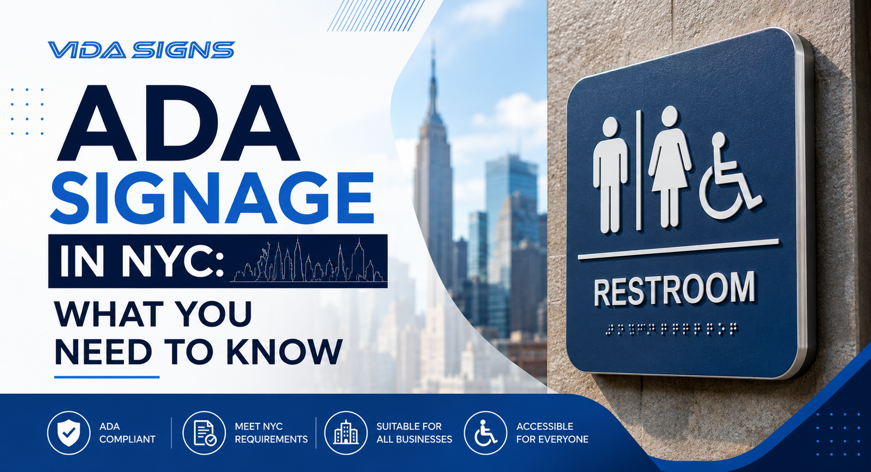
ADA Restroom Signs: A Key Requirement
Restroom signage is one of the most strictly enforced aspects of ADA compliance.
Mandatory Features
ADA restroom signs must include tactile text, Grade 2 Braille, and compliant pictograms. The International Symbol of Accessibility is often required as well.
Contrast is critical in design for ADA signs in restrooms. Text must stand out clearly against the background.
NYC-Specific Considerations
ADA signs in NYC sometimes need to align with additional local expectations. Inspectors may look for consistency across all signage, not just individual compliance.
It’s possible to meet federal standards and still run into issues locally. That’s where attention to detail matters.
The Evolution of Handicap Symbols
The familiar wheelchair symbol has evolved. The newer version suggests motion and independence rather than stillness.
Not every building has adopted it yet. Some stick with the traditional design, which is still acceptable.
But there’s a subtle shift happening. Accessibility is no longer just about compliance; it’s about perception and respect.
Common ADA Signage Mistakes to Avoid
Even with clear guidelines, mistakes happen. Usually small ones, but enough to cause problems.
Incorrect Braille Usage
It’s more common than you think. Maybe a wrong translation or misplaced dots, which render the sign non-compliant. These are errors you can’t easily verify without expertise.
Poor Color Contrast
The recommended standard is close to 70% contrast. Anything lower can reduce readability. Minimalist color palettes often fail here. Design trends don’t always align with accessibility needs.
Improper Mounting Height
This is an easy mistake to make: mounting the sign too high or too low. In this case, it’s not poor design, but incorrect installation. Wrong placement undermines compliance.
Using Decorative Fonts
Stylized fonts rarely meet ADA readability standards. Design for ADA signs requires restraint; clarity over creativity, at least in this context.
How to Ensure ADA Compliance for Your Business
The best course of action is to work with professionals who understand ADA requirements, both federal and NYC-specific.
A reliable sign company in NYC, such as Vida Signs, will guide you through material selection, picking the right layout, and correct installation. We don’t just check the regularity tick box; we aim to create a space that feels easily accessible and inclusive.
And when it comes to custom signs NYC requests, we ensure customization stays within compliance boundaries. It’s possible to achieve both with our careful execution.
Why Investing in ADA-Compliant Signs Matters
Some businesses view ADA signs in NYC as merely a compliance check, but they can have a broader impact.
Accessible signage benefits everyone, not just individuals with disabilities. It helps people know where to go, reduces confusion, and enhances user experience.
There’s also risk management to consider. Non-compliance can lead to fines, legal issues, or forced retrofits, which tend to cost more in the long run.
And then there’s reputation. Businesses that prioritize accessibility often come across as more thoughtful and inclusive. It’s subtle, but it stays with people.
Conclusion
ADA signage in New York City sits at the intersection of compliance, design, and user experience. It can feel rigid, even overwhelming at times.
But once you understand the framework, it becomes manageable. Even logical.
ADA signs in NYC aren’t just about following rules; they’re about creating spaces that work better for everyone.
Planning to upgrade the ADA signage for your business?
Vida Signs can help you get it right from the start. From compliance guidance to full design and installation, our team ensures your signage meets all ADA requirements while elevating your space.
Call (212)-388-9388 for a quote today.
FAQs
Are ADA signs required for all businesses in NYC?
Not every single business, but most that are open to the public or have employees with disabilities. If you have a permanent room (restroom, office, exit), you likely need tactile signs.
What are the key features of ADA-compliant signs?
Raised sans-serif text, Grade 2 Braille, high contrast (light/dark), non-glare finish, and mounting height between 48-60 inches.
What is the correct height for ADA signs?
The baseline of the lowest raised character must be 48 inches from the floor. The highest raised character baseline can be up to 60 inches.
Do ADA signs require Braille?
Yes, for identification signs labeling permanent rooms or spaces. Directional and informational signs do not require Braille.
What is the difference between ADA and non-ADA signs?
Non-ADA signs can use decorative fonts, low contrast, and no Braille. ADA signs follow strict tactile, visual, and mounting standards.
Can I customize ADA signs for my business?
Absolutely. You can use your brand colors (as long as contrast works), logo, and materials like brushed aluminum or acrylic, provided the tactile and Braille rules are followed.