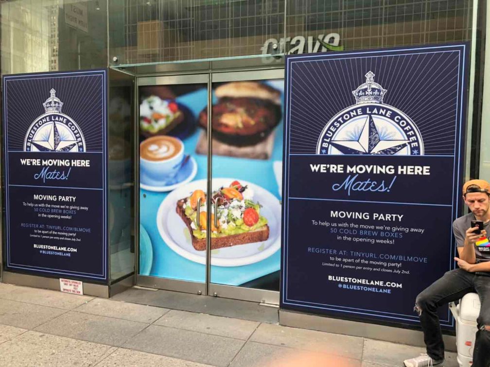
Make a Difference with Creative Business Signs In New York
23 DecWith so much competition, being discovered in New York is difficult. Don’t be a needle in a haystack. Just follow these easy tips.
Want to make your business sign stand out in New York City? Here are important tips to consider
Whether you want to be a store that stands out from its competition or you want your potential customers to be dazzled simply by looking at your signboard, a creative business sign is an amazing way to make that first impression everlasting. Commercial business signs can take various forms from the main sign above the front door to the graphical images, A-boards, POS displays and display stands – you can choose whatever format looks the best for your brand. So what’s a good or bad business sign? Here are a few great tips to various for ensuring that your signage is of high quality.
Common Mistakes to Avoid for Business Sign
Once the idea of your sign meets local regulations, it is important to ensure that no mistakes or errors are made in this process, like:
Putting it in the wrong location: You don’t want to put up your business signage at a place, where nobody is going to see it, be it on the wrong side of the road or building. Even if it is unintentional, this leads to the violation of ADA requirements if you install signage in the wrong place. The aim of your business signage is to provide information to your audience, putting them in the wrong location defies all the purpose.
Either it’s too big or too small: It is important to understand the right size for your business signage- there’s no need for a directory to take up multiple walls, and your storefront sign should be big enough to be seen from a distance. Ordering a sign in the wrong size isn’t beneficial and you end up paying the additional cost for replacement. By getting the right size, the first time, you can avoid all these unwanted hassle.
Clashing or low-contrast colors: Your business signage should be legible with high-contrast colors, it should be visually appealing and in-sync with your business’ motive. Do not choose colors that collide with the sign or your building and brand. These types of signs will nullify the motive.
Too much information: This is where ‘words do their magic’. Don’t cramp the space with all the information you know. ‘Less is more’; lead and live by it, when it comes to business signage. Long paragraphs or ‘more-than-required’ information, can end up, ‘your potential customers’ ignore the sign and move on. Simply, if no one reads your sign, no one will know anything about your business. All you need to do is, put the name of the company, your address, and a one-line brief of your service. Indoor environmental graphics might have more detail about them but hold them to a minimum for outdoor signs.
Too little information: Contrary to the above, you don’t want your audience to be clueless when it comes to your business. Use more than one word to provide the correct information to your audience. The name of your company on its own might not be enough to address what you do.
Paying too little: This is where you shouldn’t go cheap. Low-quality signs or cheaply made signage boards can make you look unprofessional. Even if it seems like the best idea to get it done at a cheap price, you are going to end up with a signage board that may end up with chipped paint or uneven texture, and will not last long. Materials and construction would look more professional with a sign designer than a printing business, so spend your money wisely; irrespective of the type of sign boards, as it is a one-time investment thing.
What Should be Considered When Undertaking Signs for Business
Vida Signs will help you build successful indoor and outdoor signs for your company. If you’re not sure what that means, some of the considerations that come into play include the following.
- It should advertise your business
- Shows potential customers where to find your company
- Easy-to-read and understand
Even when preparing the digital sign for your business, the purpose should remain the same- educating your potential customers about your business. There’s no point in preparing business signage with less or no-information. Ask yourself, ‘what are the things that my customers should know about my business?’ and then include them in your board. Preparing such LED signs will pave the path for more customers and a successful business.
Do you think your customer isn’t getting the proper information about your business? An effective outdoor sign can inform them the essential information, like the location, type of information, and address. Monument signs, pylons, and directories offer locations for potential customers to become visitors. You just need to make sure the business signage is easy to read.
Readable fonts and colors along with tactile letters and braille make your signs accessible. Don’t make the mistake of using dark-colored fonts on dark-colored backgrounds or light-on-light colour combinations. A right contrast and color resolution will help you to gain attention from the passers-by and the onlookers. We will help you create effective business signage for your company by following these and other guidelines, and we will also help you ensure that your sign can go up without violating regulations and building codes.
Looking for business signs company in New York? Pick out our high-quality sign range for an idea of what you’d want for your business. Please contact us online or at (212)-388-9388 with any questions you might have about what kind of sign is best for your business and get a free quote!

